 "pip bip - choose Corrour" (hhgttg69)
12/16/2019 at 06:39 • Filed to: almost hour rule, kia, CarAdvice.com.au
 3
3
 20
20|
"pip bip - choose Corrour" (hhgttg69)
12/16/2019 at 06:39 • Filed to: almost hour rule, kia, CarAdvice.com.au | 3
| 20 |
!!! UNKNOWN CONTENT TYPE !!!
 RallyDarkstrike - Fan of 2-cyl FIATs, Eastern Bloc & Kei cars
> pip bip - choose Corrour
RallyDarkstrike - Fan of 2-cyl FIATs, Eastern Bloc & Kei cars
> pip bip - choose Corrour
12/16/2019 at 06:46 |
|
Huh, I like it! Never knew this was in the pipeline.
|
pip bip - choose Corrour
> RallyDarkstrike - Fan of 2-cyl FIATs, Eastern Bloc & Kei cars
12/16/2019 at 07:07 |
|
me neither
 Rustholes-Are-Weight-Reduction
> pip bip - choose Corrour
Rustholes-Are-Weight-Reduction
> pip bip - choose Corrour
12/16/2019 at 07:16 |
|
Looks way better than the existing one
! Should I ever get a KIA with the current badge, I’d probably swap it for KDM badges
 Wobbles the Mind
> RallyDarkstrike - Fan of 2-cyl FIATs, Eastern Bloc & Kei cars
Wobbles the Mind
> RallyDarkstrike - Fan of 2-cyl FIATs, Eastern Bloc & Kei cars
12/16/2019 at 07:17 |
|
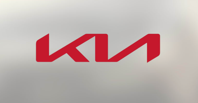
T he goal is to go to a frameless, illuminated element for the emblem.
U nfortunately, the current cars are designed for an oval so we’ll get this during the transition...
 facw
> pip bip - choose Corrour
facw
> pip bip - choose Corrour
12/16/2019 at 07:34 |
|
Hmm, well they’ve definitely needed one. Not sure the new one is good, but the current one is definitely bad.
|
RallyDarkstrike - Fan of 2-cyl FIATs, Eastern Bloc & Kei cars
> Wobbles the Mind
12/16/2019 at 07:35 |
|
Ah
, cool!
 Arch Duke Maxyenko, Shit Talk Extraordinaire
> pip bip - choose Corrour
Arch Duke Maxyenko, Shit Talk Extraordinaire
> pip bip - choose Corrour
12/16/2019 at 07:43 |
|
Is it still the same dimensions as the Ford logo so that they can be easily swapped?
|
pip bip - choose Corrour
> Arch Duke Maxyenko, Shit Talk Extraordinaire
12/16/2019 at 07:44 |
|
not sure yet
 jimz
> pip bip - choose Corrour
jimz
> pip bip - choose Corrour
12/16/2019 at 07:51 |
|
“K-backwards-N?”
 Nibby
> pip bip - choose Corrour
Nibby
> pip bip - choose Corrour
12/16/2019 at 08:44 |
|
 HFV has no HFV. But somehow has 2 motorcycles
> pip bip - choose Corrour
HFV has no HFV. But somehow has 2 motorcycles
> pip bip - choose Corrour
12/16/2019 at 08:47 |
|
K backwards N
 SiennaMan
> Rustholes-Are-Weight-Reduction
SiennaMan
> Rustholes-Are-Weight-Reduction
12/16/2019 at 08:54 |
|
The KDM badges look so much better than what we get in NA.
 and 100 more
> Arch Duke Maxyenko, Shit Talk Extraordinaire
and 100 more
> Arch Duke Maxyenko, Shit Talk Extraordinaire
12/16/2019 at 10:47 |
|
Do Kia and Ford engage in badge engineering together?
 fintail
> Rustholes-Are-Weight-Reduction
fintail
> Rustholes-Are-Weight-Reduction
12/16/2019 at 10:57 |
|
Looks like the old Kinja logo.
|
fintail
> pip bip - choose Corrour
12/16/2019 at 10:58 |
|
Hyundai needs an update more, still using the 90s era Honda-inspired thing.
|
Arch Duke Maxyenko, Shit Talk Extraordinaire
> and 100 more
12/16/2019 at 10:58 |
|
KIA was rebad ging Fords in the 1980's
 MasterMario - Keeper of the V8s
> pip bip - choose Corrour
MasterMario - Keeper of the V8s
> pip bip - choose Corrour
12/16/2019 at 10:59 |
|
It reminded me of Nine Inch Nails’ logo at first glance

|
and 100 more
> Arch Duke Maxyenko, Shit Talk Extraordinaire
12/16/2019 at 11:27 |
|
I had no idea! Thank you!
 KingT- 60% of the time, it works every time
> pip bip - choose Corrour
KingT- 60% of the time, it works every time
> pip bip - choose Corrour
12/16/2019 at 23:57 |
|
About damn time
|
Rustholes-Are-Weight-Reduction
> fintail
12/17/2019 at 01:52 |
|
Does that mean the car would break down all the time and the buttons on the dash would change positions randomly?